
|
 Somehow inspired by the logo redesigns of global brands during this year and amused by the logos remade with new Microsoft design style, we recreated our own logo.
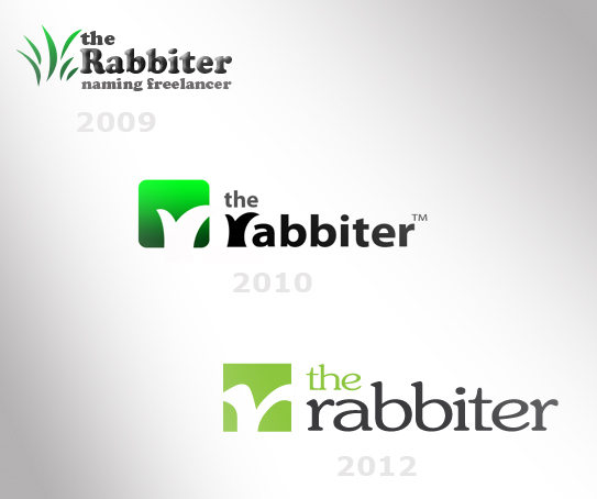
Our aim was to add cleaner lines, more class, higher readability and simplicity to our “Hidden ears” logo without changing the core concept. It was also important to make the logo suitable for the website design. The new logo already replaced the old version on our official web page, all our advertising materials and blanks, as well as on The Rabbiter’s profiles on Facebook, Twitter and LinkedIn. The logotype is developed with a modification of the font JasmineUPC in a dark grey colour, while the symbol’s background is in our favourite colour #8dc919 without the rounded corners and the gradient of the previous logos, and including the traditional hidden element in white. The element suggests several ideas: 1. It represents the letter R, the first letter of the word rabbiter. 2. It represents the ears of a rabbit. 3. It represents a cartoon trace of jumping. 4. It represents a tick evoking the idea of an approved name. Which idea did you see first?
3 Comments
28/5/2013 09:45:04 pm
It is my amazing satisfaction to check out your website and have fun with your amazing publish here. I like that very much. 21/6/2013 04:36:33 pm
I Really Enjoyed The Blog. I Have Just Bookmarked. I Am Regular Visitor Of Your Website I Will Share It With My Friends Thanks and I promises I will visit your blog again.
The Rabbiter
21/6/2013 05:13:57 pm
Thank you for your post. You are always welcome. Leave a Reply. |
Categories
All
Archives
March 2023
|
 RSS Feed